- Timeline
- July 2022 – August 2022
- My Role
-
- Research
- Product Design
- Engineering
- Collaborators
- Tech
-
- Mapbox
- Svelte
- Tailwind
- Website
- Source
 Zhi Keng He
Background
BetaNYC is a non-profit civic tech organization which builds tools and hosts public events to increase access to civic data and demystify government processes. I joined BetaNYC for 8 weeks during Summer 2022 as a Civic Innovation Fellow.

BetaNYC operates out of the Manhattan Municipal Building at 1 Centre Street. Technologists work alongside urban planners and other city professionals. Photo by Mattia Panciroli via Flickr, 2012.
The Challenge
Every day, you cross dozens of invisible borders: city council districts, school districts, police precincts, fire battalions, senate districts, zip codes, and more. These borders, although invisible, affect your life in important ways. Who collects your trash? Who represents you? Who arrives to care for you if you’re injured? To answer these questions, it helps to know exactly where boundaries begin and end—and how they overlap.
BetaNYC maintains an open source web app called NYC Boundaries Map. First launched in 2018, the Boundaries Map allows anyone to view and explore overlapping jurisdictional boundaries within the city. The map is commonly used by city council staff and community boards in order to direct feedback from constituents to the correct department.
The Boundaries Map helps answer questions like, “which school districts does this community board serve?”, “which sanitation district do I contact about the trash at 2nd Avenue and East 14th Street?”, and “what police precinct am I in right now?”
The map was not pleasant to use.
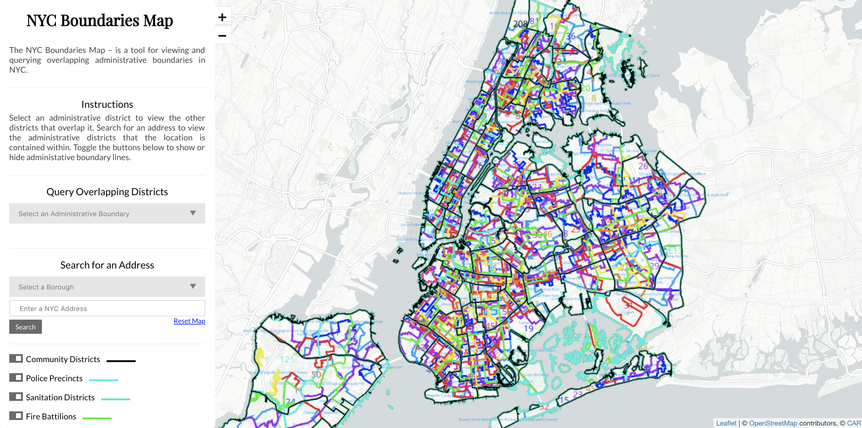
The original Boundaries Map. 13 separate boundaries render with 13 separate border colors and labels. A rainbow spaghetti of geographic data.
Working together with Zhi, we noted several usability issues:
- Toggling on more than two districts quickly made the map illegible.
- Boundaries on the map itself were not interactive.
- The map’s implementation in Leaflet resulted in rasterized borders and labels, which looked blurry on HiDPI screens.
- Viewing overlaps required a complex sequence of “querying” boundaries by selecting an administrative region and then selecting which district to intersect with, and the query itself was slow to execute.
- The map required frequent manual zooming and panning, since it did not adapt automatically to queries.
- Searching for an address required pre-selecting a borough.
- Viewing additional metadata about a district required leaving the app and searching Google.
- The app was desktop-only.
- Visual design polish was generally lacking.
Additionally, there was no frontend framework in use (!) and I felt there was an opportunity to modernize and speed up development by adding one.
Research and Build
With a solid list of usability tickets to address, I got to work sketching ideas for how we might fit things together.
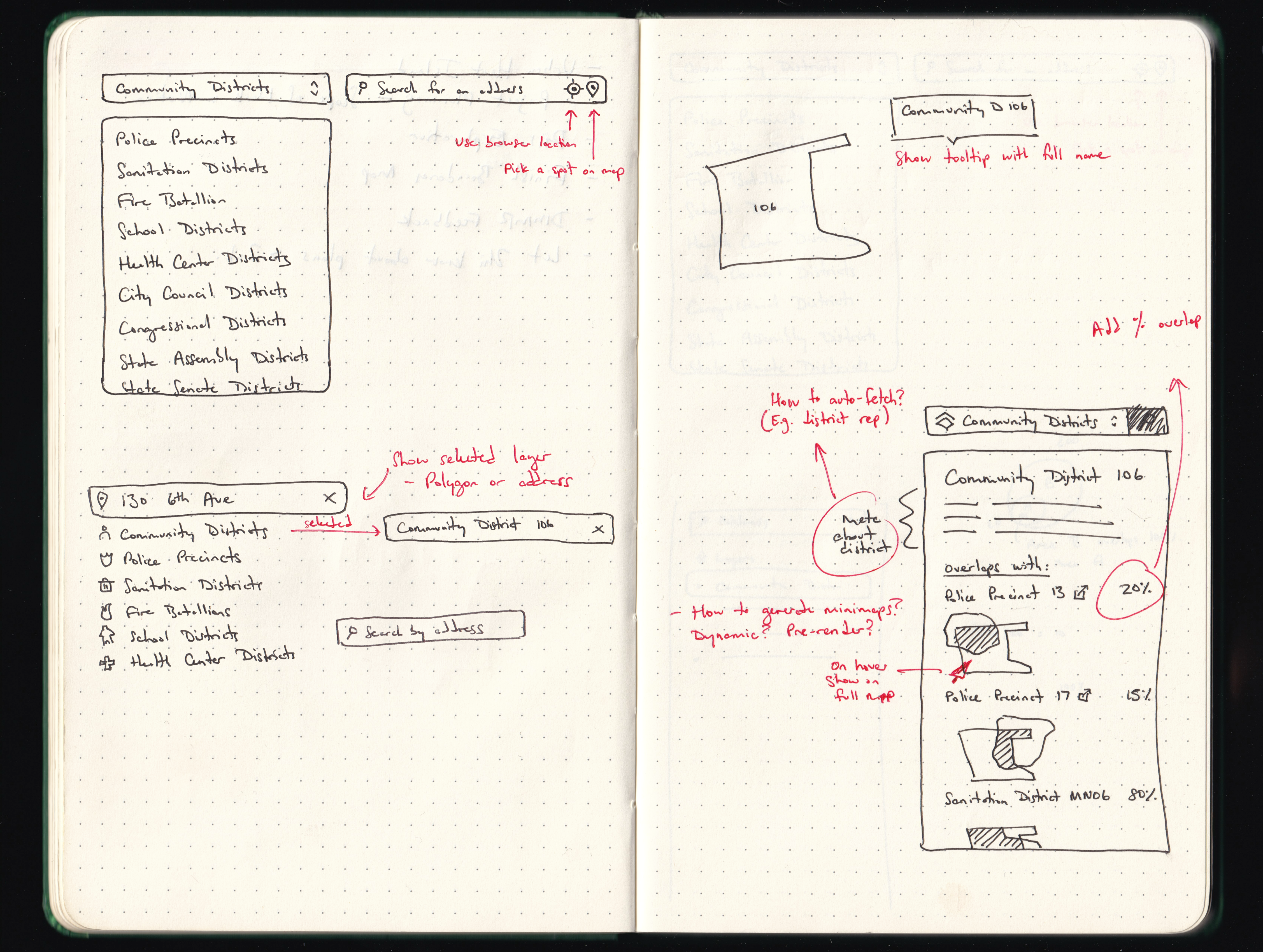
Sketching ideas. I explored how we might combine location search, district browsing, and overlap browsing within a single interface.
Without delay, we dove into code. After quick exploration with various frontend libraries, I installed Svelte and Tailwind, which would allow us to build more advanced functionality more easily. We moved from Leaflet to Mapbox since it offered us exciting opportunities to interact with the map directly.
We scheduled video calls with some frequent users of the Boundaries Map in order to better understand how they were using the tool and what could be improved. We shared our work-in-progress prototype for feedback. The participants were excited to be a part of the process and helped validate assumptions we had made.
Outcomes
After a few short weeks, we announced the updated app.
The new Boundaries Map. The updated app features overlaps on hover, direct interaction with the map, a unified navigation bar, and clearer information hierarchy.
The new map automatically zooms and pans to the selected boundary. It displays boundary overlaps on hover, allows single-click filtering by clicking any boundary, and supports mobile viewing. It links to the relevant webpage for a district when available, so users can find things like phone numbers for city council members. And it now allows users to share URLs for filtered views, and export overlap data to JSON for analysis in other tools.
Read the announcement or explore boundaries.
Reflections
I had never worked with mapping technology before, so it was fun to learn about how to wield geospatial data using Mapbox. (Huge thanks to Zhi sharing his knowledge of GeoJSON and Shapefiles!) Svelte and Tailwind were also new frameworks for me, and this project helped me get more familiar with their capabilities.
With extra time, I’d explore how to improve mobile navigation, since touchscreens can’t support the same hover interactions as desktop. I’d also explore whether it’s worth introducing color to the base map to more clearly communicate the locations of parks, water, and other regions. (Boundaries Map is open source, so maybe I’ll get to these one day! Or maybe you, my reader, can make contributions of your own.)
BetaNYC introduced me to the city’s vast library of open data, and I’ve continued to think about other possibilities for design and technology to surface public data for good.